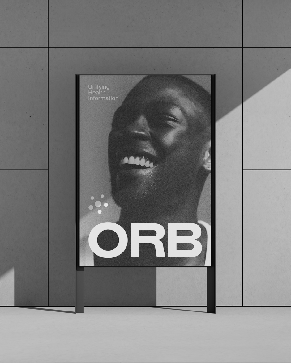
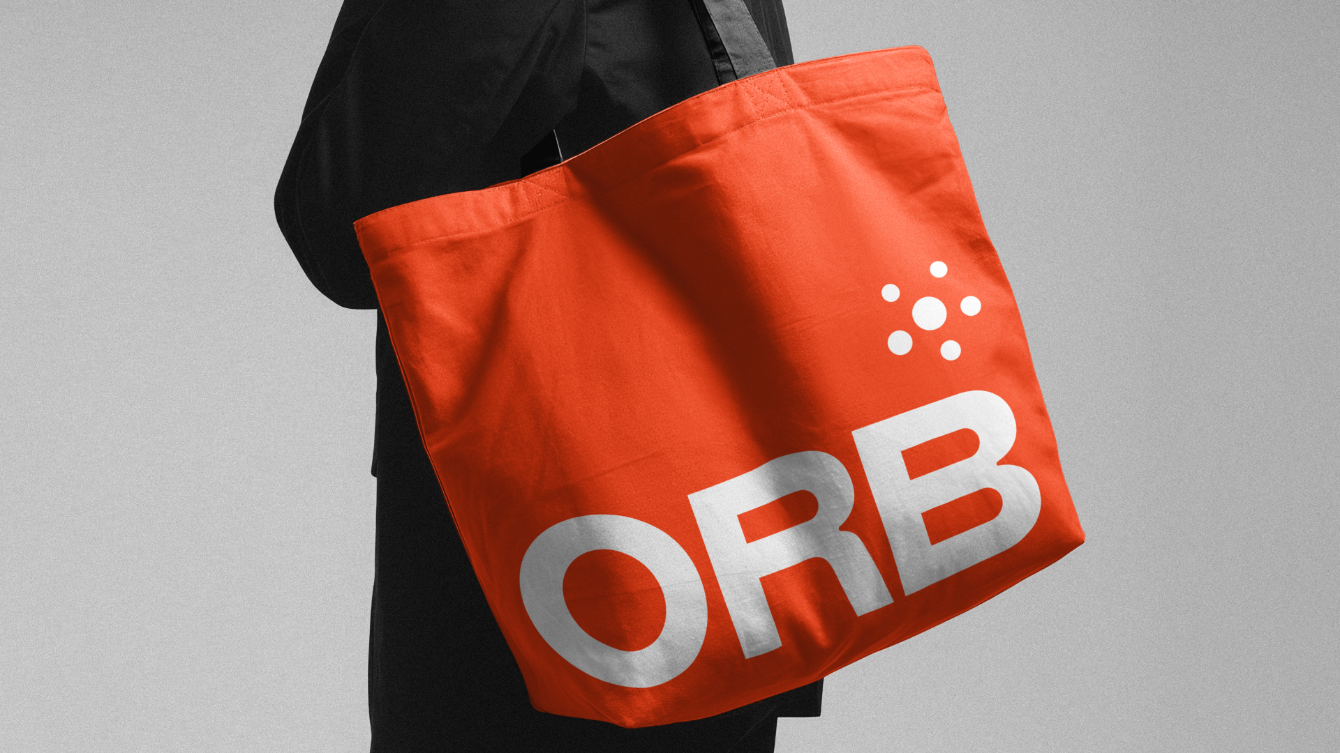
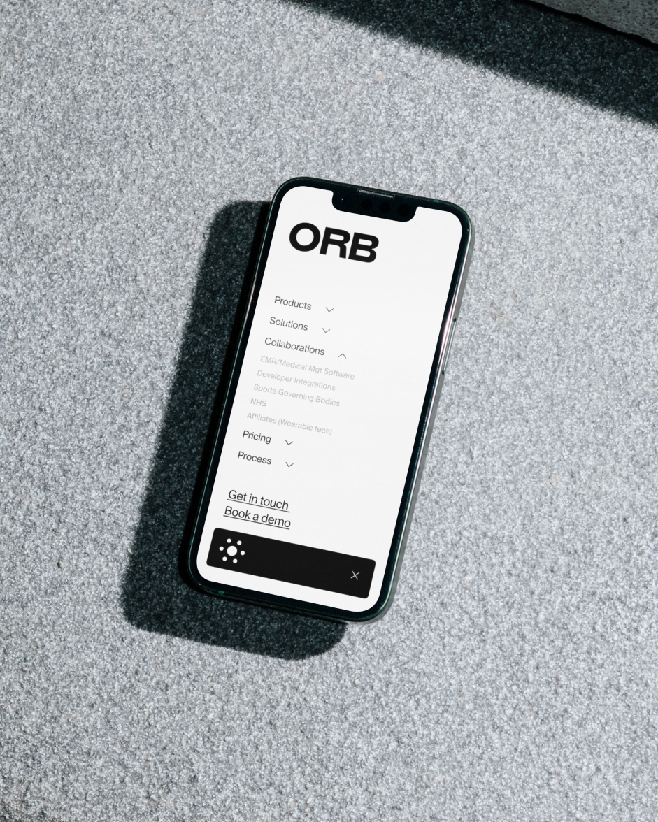
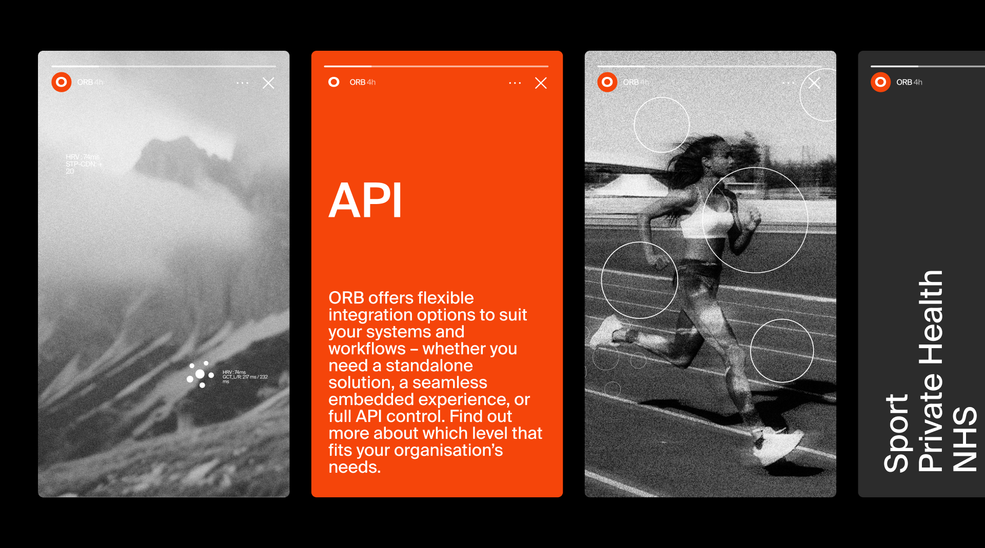
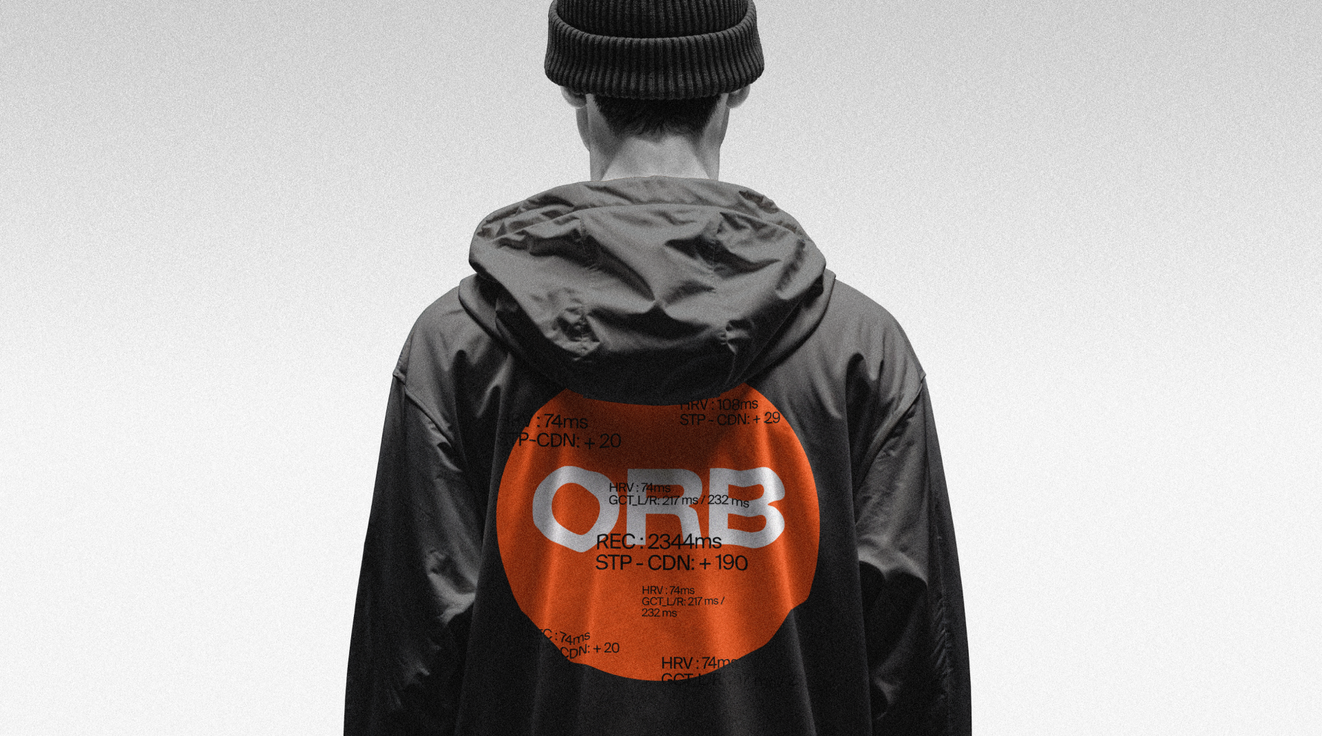
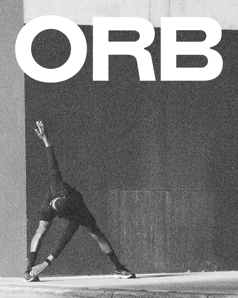
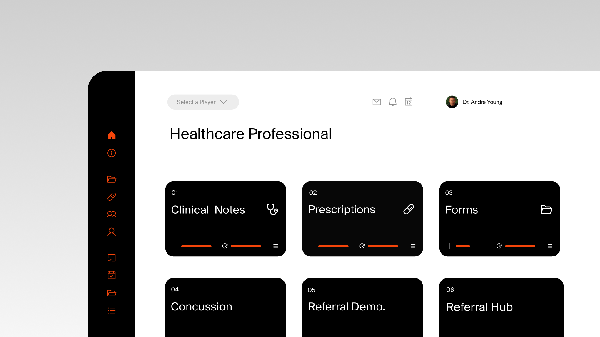
ORB brings together fragmented health information – connecting systems, users, and digital health records to make vital data accessible anytime, anywhere. It’s a brand built around clarity, connection, and the power of technology to improve lives.
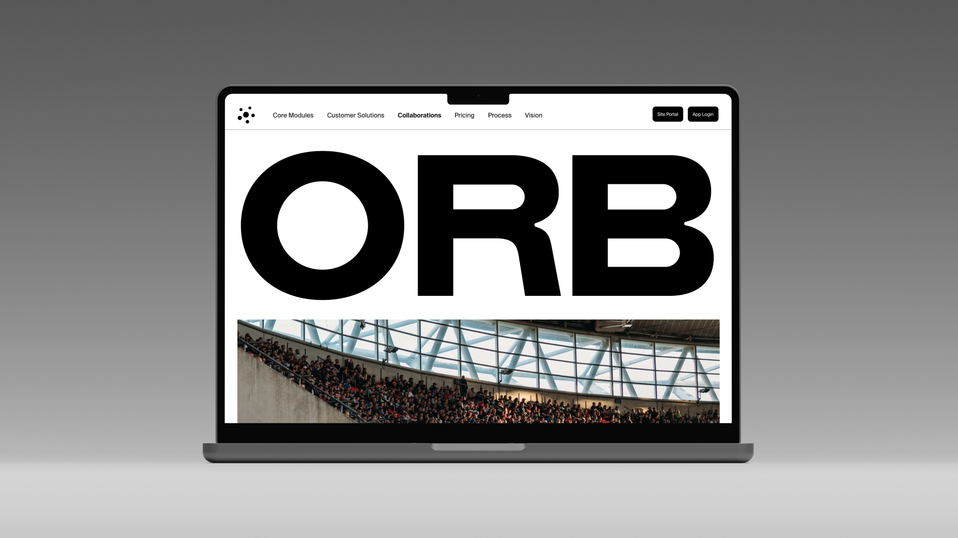
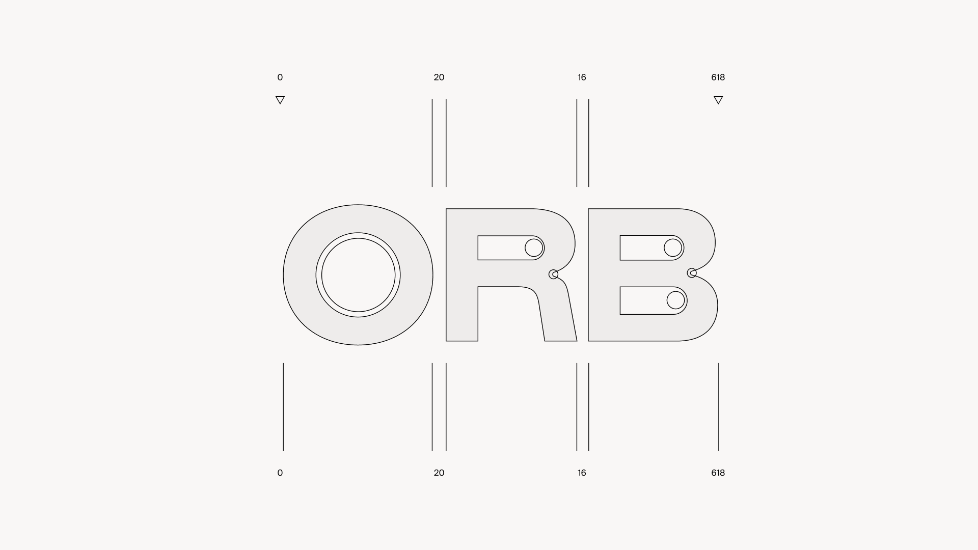
We worked closely with this UK-based startup to bring the ORB brand to life. What began as a naming and identity exploration quickly evolved into something much deeper. As the visual language took shape, the brand’s name and direction shifted – an organic process driven by collaboration, creative experimentation, and a shared belief in the impact of thoughtful design.
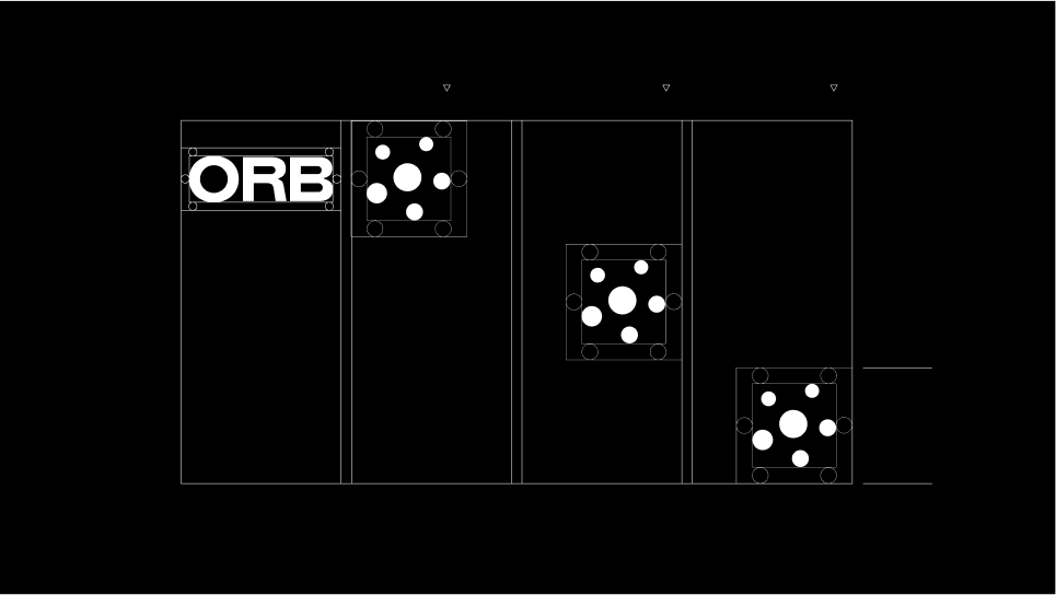
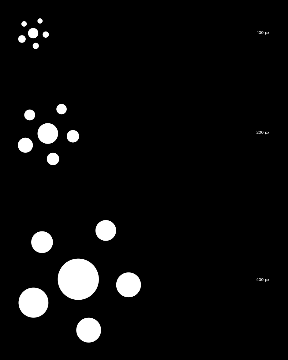
The idea sprung from the idea of 'Connect the Dots'. In our first phaze of exploration we used data points to create forms and shapes, to be expressive and tell stories. Through motion this quickly developed into something that has become very different to anything out there. A brand that is deeply connected with the very simple expression of data through simple and playful visualisation of the dots that deliver the information to the athletes using the product.
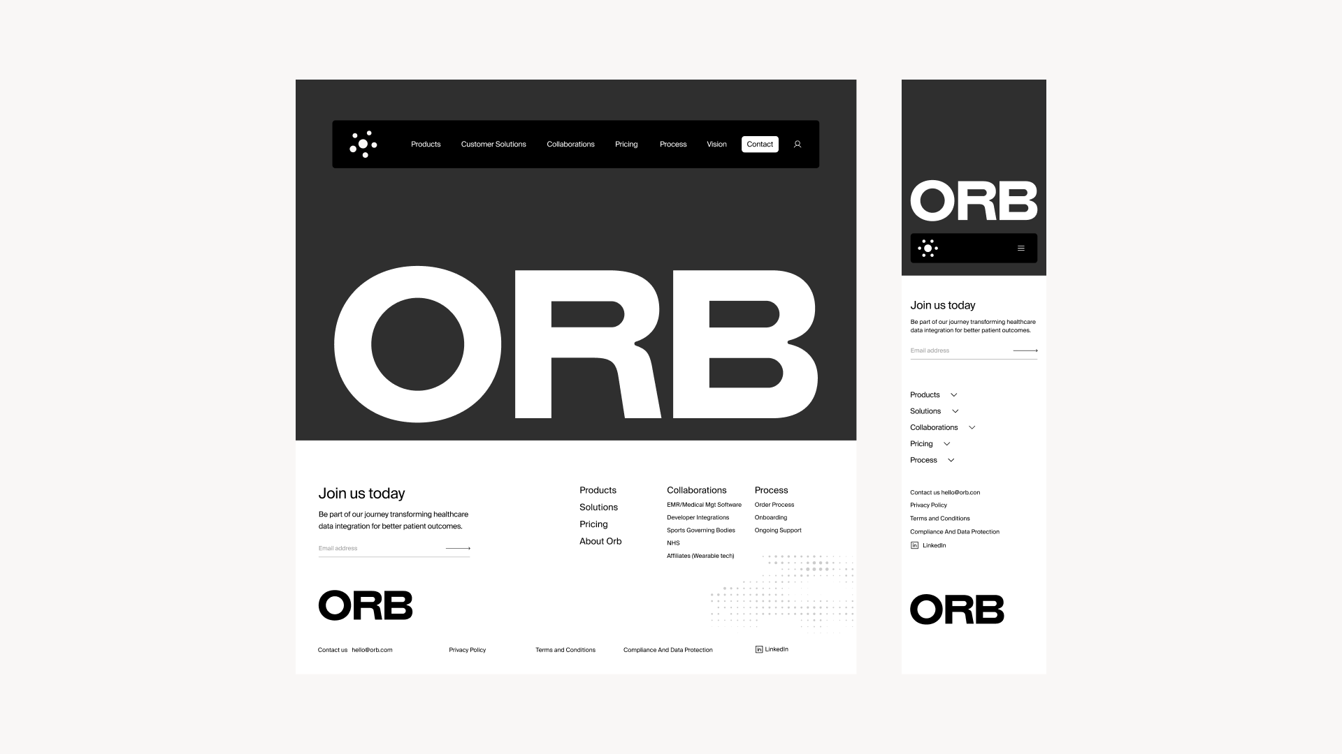
Built @Hyperfocus





Paul Watmough-Halim